WALL&DECÒ / COLLECTION BOOK I
paNtoNE®
colors
mooDs
Floralia
Naturae
Only Pattern
The Pop
Rarefied air
Go macro
Textile breathe
Per essere squillante non è detto un
colore debba essere riportato alla massima
tonalità. Al contrario, i colori puri possono
peccare di eccessiva virulenza, e male accor-
darsi in una palette complessa.
È un po’ la differenza che sussiste fra la
prima arte pop inglese, quella di Richard
Hamilton, e il pop statunitense, specie nella
versione più cromaticamente accesa, quella
dei Warhol e dei Lichtenstein.
L’effetto di artificialità della prima con-
trasta con la brutale figuratività della secon-
da: è rarefatta, anche poetica, ancora evo-
cativa, ovvero quasi suggerita, mai urlata,
anche se per questo non meno straniante.
Rarefatta, appunto.
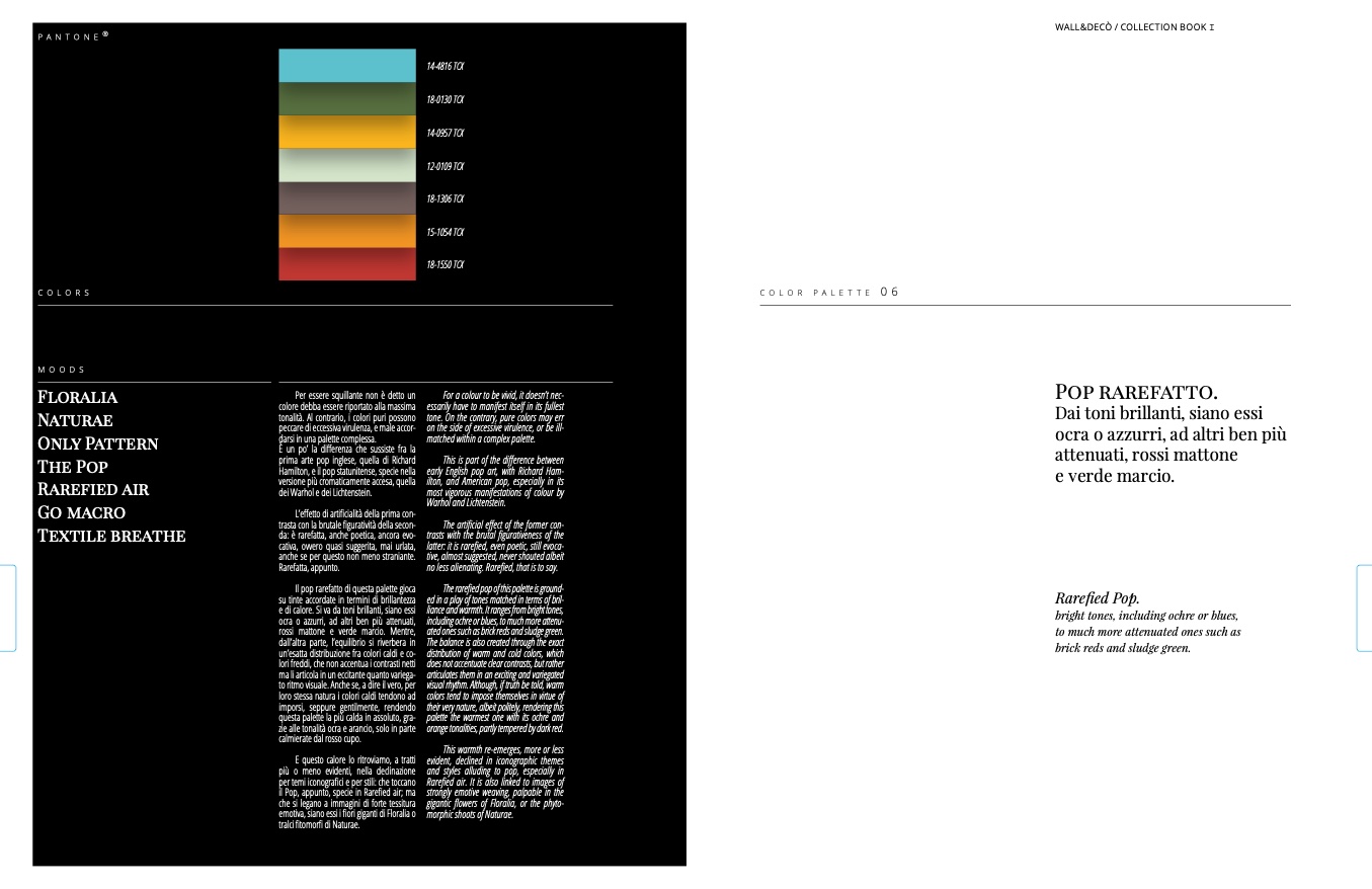
Il pop rarefatto di questa palette gioca
su tinte accordate in termini di brillantezza
e di calore. Si va da toni brillanti, siano essi
ocra o azzurri, ad altri ben più attenuati,
rossi mattone e verde marcio. Mentre,
dall’altra parte, l’equilibrio si riverbera in
un’esatta distribuzione fra colori caldi e co-
lori freddi, che non accentua i contrasti netti
ma li articola in un eccitante quanto variega-
to ritmo visuale. Anche se, a dire il vero, per
loro stessa natura i colori caldi tendono ad
imporsi, seppure gentilmente, rendendo
questa palette la più calda in assoluto, gra-
zie alle tonalità ocra e arancio, solo in parte
calmierate dal rosso cupo.
E questo calore lo ritroviamo, a tratti
più o meno evidenti, nella declinazione
per temi iconografici e per stili: che toccano
il Pop, appunto, specie in Rarefied air; ma
che si legano a immagini di forte tessitura
emotiva, siano essi i fiori giganti di Floralia o
tralci fitomorfi di Naturae.
14-4816 TCX
18-0130 TCX
14-0957 TCX
12-0109 TCX
18-1306 TCX
15-1054 TCX
18-1550 TCX
For a colour to be vivid, it doesn’t nec-
essarily have to manifest itself in its fullest
tone. On the contrary, pure colors may err
on the side of excessive virulence, or be ill-
matched within a complex palette.
This is part of the difference between
early English pop art, with Richard Ham-
ilton, and American pop, especially in its
most vigorous manifestations of colour by
Warhol and Lichtenstein.
The artificial effect of the former con-
trasts with the brutal figurativeness of the
latter: it is rarefied, even poetic, still evoca-
tive, almost suggested, never shouted albeit
no less alienating. Rarefied, that is to say.
The rarefied pop of this palette is ground-
ed in a play of tones matched in terms of bril-
liance and warmth. It ranges from bright tones,
including ochre or blues, to much more attenu-
ated ones such as brick reds and sludge green.
The balance is also created through the exact
distribution of warm and cold colors, which
does not accentuate clear contrasts, but rather
articulates them in an exciting and variegated
visual rhythm. Although, if truth be told, warm
colors tend to impose themselves in virtue of
their very nature, albeit politely, rendering this
palette the warmest one with its ochre and
orange tonalities, partly tempered by dark red.
This warmth re-emerges, more or less
evident, declined in iconographic themes
and styles alluding to pop, especially in
Rarefied air. It is also linked to images of
strongly emotive weaving, palpable in the
gigantic flowers of Floralia, or the phyto-
morphic shoots of Naturae.
color palEttE
06
Pop rarefatto.
Dai toni brillanti, siano essi
ocra o azzurri, ad altri ben più
attenuati, rossi mattone
e verde marcio.
Rarefied Pop.
bright tones, including ochre or blues,
to much more attenuated ones such as
brick reds and sludge green.
MOODS

